( Free · in the browser · no sign-up )
HSL color editor in your browser.
Hue. Saturation. Luminance. Bluer skies. Natural skin tones. Eight color ranges.
Adjust hue, saturation and luminance across eight color ranges, review the preview and export in your browser.
You can also drag and drop one or multiple images in this area.•Accepted inputs: JPEG, PNG, WEBP, GIF and BMP when the browser can decode them. Export is available as JPEG and PNG, and as WEBP when the browser supports that encoding.
Image editing runs in the browser. The site can still make technical requests and, subject to your consent, load measurement or advertising. Read the Privacy Policy.
- 01No installation
- 02In-browser editing
- 03Preview before export
- 04No sign-up
( How it works )
Adjust color in 3 steps
- ( 01 / 03 )
1. Choose an image
Open a compatible file or use the project-owned demo photo.
- ( 02 / 03 )
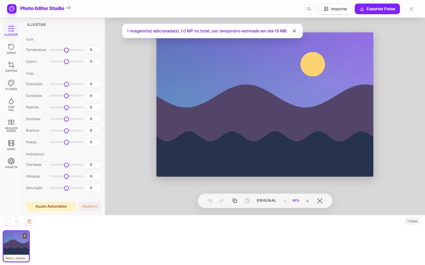
2. Adjust a range
Choose one of eight colors and change hue, saturation or luminance.
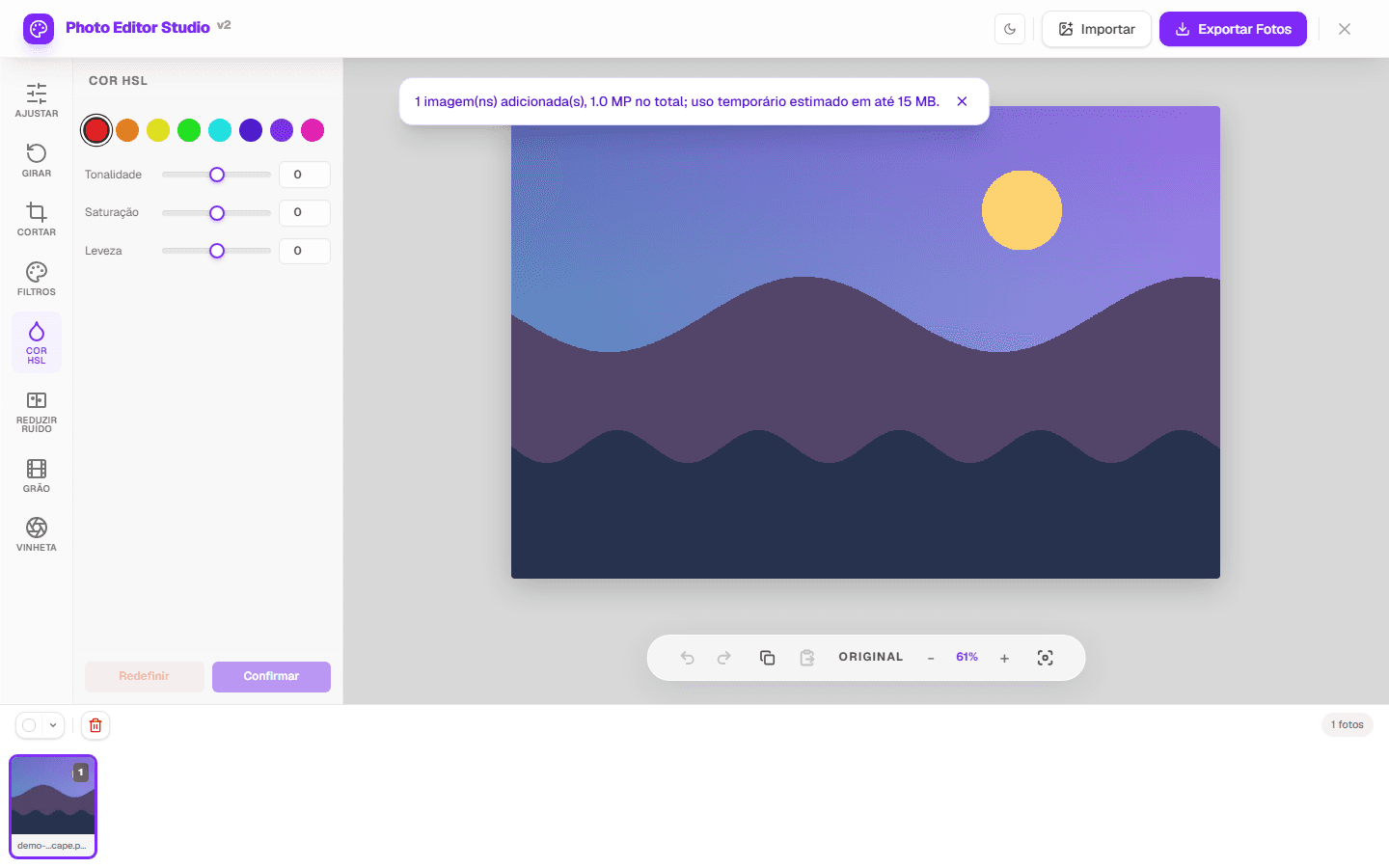
- ( 03 / 03 )
3. Compare and export
Review the original, then export as JPEG or PNG, or as WEBP when the browser supports it.

( The interface )
Current tool interface
( What it does )
What the HSL panel does
- 01
Eight color ranges
Red, orange, yellow, green, aqua, blue, purple and magenta have separate controls.
- 02
Three controls per range
Hue shifts color, saturation changes intensity, and luminance changes brightness.
- 03
Visual comparison
Switch between the source and edited preview before export.
( What people use it for )
When HSL is useful
- ( 01 )
Sky and foliage
Refine blues and greens separately when they occupy distinct ranges.
- ( 02 )
Skin tones
Make small changes to oranges and reds and inspect nearby areas.
- ( 03 )
Consistent palette
Apply similar settings across photos and review each result.
( Where your pixels go )
( Local processing )
Where your image is processed
The editing itself happens in your browser. When you open a file, the browser decodes it into pixels held in the page's memory, and every adjustment is a computation performed on those pixels by your own device's processor. Export re-encodes the result and hands it to the browser as a download. The image file is not uploaded to an editing server for any of these steps.
That is a statement about image processing, not about the page as a whole. Loading this page is a network request like any other, and the page can make further requests: fonts, scripts, and — subject to the choice you make in the consent banner — measurement or advertising. Those requests carry the information any web request carries. The distinction matters, and the Privacy Policy sets out what is collected and when.
- Decoding, editing and export run on your device, using the browser's Canvas APIs.
- The image file is not sent to an editing server as part of the editing workflow.
- The page itself is served over the network and can load consented measurement or advertising.
- Closing the tab discards the working copy held in the page's memory.
( Questions? Answered )
Frequently asked questions
Does HSL select one object?
No. It works by color range, so other pixels in that range can also change.
Is the image sent to an editing server?
Pixel processing runs in the browser. Normal site requests and consented services are documented in the Privacy Policy.
Which formats can I save?
The export dialog offers JPEG and PNG, and adds WEBP when the browser supports that encoding.
( In depth )
Working in hue, saturation and luminance
HSL restates colour in terms a person can reason about. Where RGB describes a colour as three amounts of light, HSL describes it as a position on the colour wheel, a distance from grey, and a brightness — three questions with intuitive answers. That change of coordinates is what makes selective colour adjustment approachable.
Why a second colour model exists at all
RGB describes colour the way a screen produces it: quantities of red, green and blue light added together. It is exact and it is difficult to reason about, because the components do not correspond to anything a person perceives. Making a colour slightly more orange without changing how bright it is means adjusting all three numbers together in a relationship that is not obvious.
HSL re-expresses the same colours in three perceptual dimensions. Hue is an angle around a colour wheel, from red through yellow, green, cyan, blue and magenta and back to red. Saturation is distance from the central grey axis — zero is neutral, maximum is the purest form of that hue. Luminance is how light or dark the colour is, from black through the colour to white.
The two models describe the same set of colours; HSL is a transformation of RGB, not a different gamut. What it changes is which questions are easy. 'Make the greens less yellow' is one adjustment in HSL and a calculation in RGB, and that is the entire reason the model is used in editing tools.
The eight ranges, and what a range really is
A selective colour panel divides the hue wheel into named bands — typically red, orange, yellow, green, aqua, blue, purple and magenta — and offers three controls within each. The important thing to understand is that these are ranges of hue, not selections of objects. Adjusting the blue range acts on every pixel whose hue falls in that band, wherever it appears.
This has a direct consequence that surprises people the first time: adjusting the blues to deepen a sky will also affect blue clothing, blue signage, and the blue component of shadows falling on neutral surfaces. Nothing is wrong when this happens. The tool is doing exactly what it claims — it selects by colour, and those pixels are that colour.
The bands also overlap at their boundaries rather than meeting at hard edges, which is deliberate. A hard boundary would produce visible banding wherever a gradient crossed from one range to the next: a sky shading from blue to cyan would show a seam. Overlapping the bands means a pixel near a boundary is affected partly by each neighbouring control, and the transition stays smooth.
Skin tones sit in a narrow and unforgiving band
Human skin, across the full range of complexions, occupies a surprisingly narrow slice of the hue wheel — broadly between red and yellow, concentrated in the oranges. Complexions differ far more in luminance and saturation than in hue. This is useful to know because it means the orange control is the one that governs skin, and it means that control deserves smaller movements than the others.
Viewers are also more sensitive to error in skin than in any other colour, because they have a lifelong reference for what it should look like. A green cast in foliage passes unnoticed; the same magnitude of shift in a face is immediately visible as wrong. A hue shift of a few degrees in the oranges is usually the limit before a complexion starts to read as sunburnt in one direction or jaundiced in the other.
The practical approach is to treat the orange and red controls as fine adjustments and to use luminance rather than saturation when skin looks flat. Raising the luminance of the oranges brightens skin while leaving its colour alone, which is almost always closer to what the image needed than adding saturation.
Where selective colour genuinely separates
The technique works best when the colours you want to change are far apart on the wheel from the colours you want to leave alone. A landscape is close to the ideal case: sky and water sit in blue and aqua, foliage sits in green and yellow, and the two groups barely overlap. Deepening the blues and adjusting the greens independently produces exactly the result the controls suggest.
It works least well when the image is dominated by a single family of hues. An autumn scene in which the leaves, the light and the ground are all in the red-to-yellow range offers the tool little to separate — every control you reach for moves most of the frame. In those images the useful adjustments are global ones, and selective colour has little to contribute.
A useful diagnostic before starting: name the two or three colour groups in the image and ask whether they are neighbours on the wheel. If they are, expect the adjustments to bleed into one another, and plan to make smaller changes than you otherwise would.
Luminance is the control that gets overlooked
Of the three controls in each range, luminance is the one that most often produces the result people were reaching for with the other two. Darkening the luminance of the blue range deepens a sky in a way that reads as natural light, because that is what happens to a sky as it darkens. Raising the saturation of the same range produces a more intense blue that frequently reads as processed, because real skies do not become more colourful as they deepen.
The same holds for foliage. Lowering the luminance of the greens and yellows makes vegetation look denser and better lit; raising their saturation makes it look artificial rather quickly, because the eye knows roughly how colourful a leaf can be.
The habit worth building is to try luminance first whenever a colour region looks weak, and to add saturation only if luminance alone did not get there. It is the adjustment least likely to announce itself as an edit.
( Keep going )
Continue with the right workflow
- ( 01 )Adjust photoCorrect light and contrast before selective color work.Read
- ( 02 )Measured HSL examplesCompare three real exports, settings, and pixel differences.Read
- ( 03 )HSL guideLearn the controls and a repeatable order of work.Read
- ( 04 )Format comparisonCompare file size and pixel differences measured from one source image.Read
( Ready when you are )
Ready to adjust a color range?
Open an image, make a small change and compare it with the original before export.